Showing posts with label OUPD201. Show all posts

Thursday, 7 June 2012

WAHOO


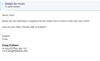
Unfortunately I couldn't do this date as I will be in Kos.

Craig has emailed me back since and I will visit on the 25th of June at 6pm with my printed portfolio.... to say I've nervous is a understatement.

RAW said some very kind things:
Afternoon Sarah,

Apologies for the late reply – we've been (and still are) incredibly busy, so replying to students and graduates has slipped to the bottom of my things to do.

Thanks ever so much for sending your details through (and for the kind words) – you have a strong portfolio, especially for a 2nd year student. I'm sure we could spare some time over the summer. Our creative director is currently on holiday, however I'll have a chat with him when he returns and see what we can offer you.

Thanks,
Tom

PS. If I don't get back to you within the next couple of weeks, just give me a nudge.

–
Tom Heaton
–
Senior Designer
–
Raw

So fingers crossed.


Evaluation of PPD level 5

I have learnt a lot throughout this module. It is all about self promotion, not matter how good you are, you will never have something just handed to you. You have to sell yourself. Each task has been a insight into the industry and how it works. Throughout this module I have grown as a designer and I am now beginning to understand what designer I want to be. It has made me consider options I never thought about.


I know my brand development could be stronger, I ended up focusing my time more on who I want to contact and fully understanding where I want to be within the industry. However, I have developed my brand several times and I feel it will be one of those things that I will almost always be nearly happy with.


It is now a case of developing these tasks and skills further. I know I need to carry on this professionalism into 3rd year and add a lot more to my CV: placements, studio visits, freelance work, more design work, better strengths within my design, etc.

Putting together the presentation was a nice reminder of where I was and where I am now. It makes me quite excited to think where I could be next year.

Sunday, 3 June 2012

Contacting more studios

More emailing...
now I feel confident to send out my portfolio pdf.


Emailing the studios that didn't respond.


Saturday, 2 June 2012

Anologue / Leeds / T3

analogueBrand identity / Packaging / Art direction / Photography / Copywriting / Web
With a varying array of clients, we need our extensive experience team that focus in on both print and digital media.

The do the menus for Jakes bar and the place I work Neon Cactus. I really like the style they have taken with both of them. They seem to understand the feel of both bars, I defiantly enjoy the design.

The Beautiful Meme / York / T3

the beautiful meme: we craft ideas for brands who love to be noticed. 
The agency when brands are ready to change.

I remember the Creative Director coming into LCA when I was in first year. I have heard 2 talks by them and I really like them. They have a great ethos an it is interesting to hear how they work with a creative director and a copy writer, they go hand-in-hand.


SWOT
S
They know what they are and who they are aimed for, their website is direct and to the point, a great strength.

W
They are very focused, which is good, but this means that their clients are very specific to brands that want a change. They have been around for long enough to have a great business.

O
They have a strong team and a great ethos and from when I have heard them speak they are very persuasive and sure of themselves. This sort of positivity makes great opportunities. They always speak about doing more for the client and thinking outside the box.

T

They are in York, it is a old town and not very central to anything.

Friday, 1 June 2012

Social Networking T6

This is defiantly something I need to be better at, I think I have always found Twitter annoying, I'm not a fan or Tumblr or Behance. I do not think I need Tumblr or behance, but I set them up non the less. 
However, when I was on my placement at andpartners, James (one of the designers) said Twitter is the most important thing the internet brought us. He has spoken to tons of design studios and creative directors through it, he said it was also a great way to get yourself noticed, your work and your views. I promise myself this summer I will become a Twitter fan and Tweet to my hearts content.
Pinterest is just a easy way for me to keep organised, I see something on the internet I can pin it immediately and it's there.


I have a website: http://cargocollective.com/sarahlroberts
I have a pinterest: http://pinterest.com/nodefinition
I have twitter: #sarahlrobertsgd
I have tumblr: http://whereveritravel.tumblr.com/
I have behance: http://www.behance.net/sarahlroberts

My website / T6

http://cargocollective.com/sarahlroberts
Yesterday I sent about 2 hours putting up more work from the last project and altering some sections and areas. When I have more free time after the PPD hand in I will try out other cargo layouts, to see if I think they are better suited to me.


I have also bought the name and hosting for www.sarahlroberts.co.uk ... I need to figure out HTML coding then I'll be able to put my work onto a proper website.
I post the link as updates apear on my facebook, a few friends I have lost contact with have messaged me re-guarding potential work.

Creative CV pdf T4

Monday, 28 May 2012

Trying a new brand / T5

I have a few worries about using a serif type for my business card and branding, I feel that I don't want to associated as a girl. I want to be neutral. For this I feel the best thing would be to use simple type. I think because I have applied so many different ideas towards me simple is the best, as long as it looks professional. I always try and over complicate things.


FONTS: I was thinking about font ans because I want to change my colour scheme to bright colours because my type will be very simple. I want to use a standard type. I want it to be a sans serif. Thinking about helvetica, but I'm not too sure. I love Gill sans, but it is not the feel I want to give my brand. So I thought Futura. Below is Futura-book. I love this font, so why not use it. 

 Double sided VS single sided?

Think now I'm leaning towards single with a bright coloured stock spray mounted to.

I've picked the one with the orange colour.


Sunday, 27 May 2012

logo / T5


The idea was to use a serif font for my name, very typical I know of the letters S and R, but it is something I always wanted to try. I am always drawn to pretty display type.


Wednesday, 23 May 2012

Ordered business cards / T5


Moo is meant to be amazing, I admit I was impressed with the packaging / the free sample / the time it took to get here...
But I ordered the 'GREEN' cards. 
The colour is nearly flaking off, I should have gone for 'Classic'. 
For now I'd like to make my business cards in uni, using good stock and hand craft.


Tuesday, 22 May 2012

T5 - starting

'Brand you' is always something I have had a problem with. I find it hard to brand myself, I think I look too much into things. I know I need to create a simple but effective brand, but what should it look like? Should I use a serif, a sans serif? 


I learnt a lot about this in the type module and what I need on my business cards is my logo, name, web address, contact information (usually tel & email).
Here are some I made in the type module...


I need to think about colour and it MUST work in black and white.


Think about the quality & processes used. 


NEED TO USE IT:
print collateral (stationary, business cards, mail outs, invoices, etc)
online (websites and Creative CV's)


It needs to be simple, memorable, timeless, versatile and appropriate.


business cards I sent John

Here are the business cards I sent John in a PDF.


I was intending to print the coloured backs on the correct coloured stock if I can find some that's the right colour. 
I've not printed any yet as James in the dungen is pretty busy!
I wanted to use pastel colours to represent me, but not focus on pinks and blues.


Since sending them I received my order from issuu.... I really dont like them anymore. I have to make new ones. Not looking forward to this but I just don't like them at all.


Thursday, 17 May 2012

Corridor8 / DUST / Sheffield / T3


CONTACT:

E: studio@du.st
T: +44 (0) 114 258 2266
A: R10 Sheaf Bank Works, Sheffield UK, S2 3EN